The Solution
Call to Action
Think about your primary users’ goals. What do your main users need to see in order to achieve what they’re looking for? Write down what your primary CTA will be for your home page. A paragraph explaining the CTA is fine - an explanation paired with a sketch is better.
One of the main purposes of the website should be to educate visitors about the company (mission, operations, etc.), but this is a function that does not require a CTA, as people can simply read without clicking or being directed elsewhere. The page that initially pops up on the website is directed to people who are receiving the service. Because of this, the primary CTA should be a link to a place where people can sign up to receive meals. It appears from the current website that people who want to help the organization will be able to help most by contributing monetary donations. Because of this, the secondary CTA should function as a place to donate to the cause.
Style Tile
Think about some key adjectives that describe your client. Pair these words with color, type, texture, logo, buttons to create a Style Tile that defines the look and feel for your site.
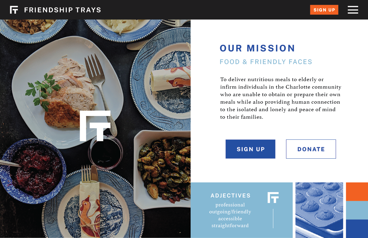
For the style tile of the new website, I created a straightforward and approachable design that would be easy for visitors to comprehend and interact with. I created a new logo for Friendship Trays that is simple yet conveys the purpose of the organization; the shape of the letters represent a table and stool, which evokes the organization's mission to provide meals for those who are unable to do so for themselves.